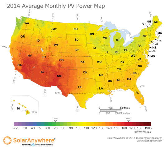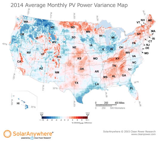
Solar resources naturally vary from year to year, and 2014 was no exception. While the 2014 average monthly solar resource map shows expected patterns, with the greatest energy output in the southwest, the real story is revealed by the PV power variance map.

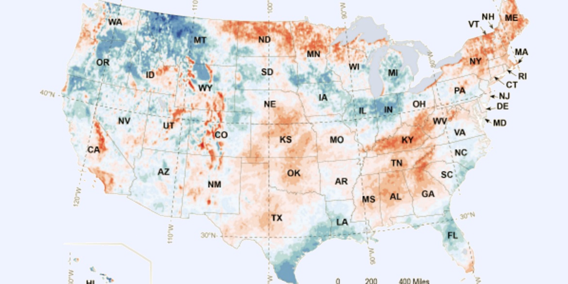
The PV power variance map, which highlights how the average energy production in 2014 compared to typically expected long-term annual energy production, reveals noteworthy above and below swings in 2014. Red indicates higher-than-typical energy production, and blue indicates lower-than-typical energy production.
The variance map shows portions of the western, southwestern and South Central United States, as well as the Mississippi Valley, experiencing above-average PV production due to drier and sunny conditions. For example, a 4-kW PV system in San Diego, California, would have produced approximately 580 kilowatt-hours (kWh) during an average 2014 month (145 kWh x 4 kW = 580 kWh), which was about 2.5% above the typical monthly production.
Meanwhile, below-average PV energy conditions dominated the Gulf Coast and Florida regions, as well as the Great Lakes and northeastern U.S. due to wetter and cloudier-than-average conditions. For example, a 4-kW system in Houston, Texas, would have produced approximately 440 kWh (110 kWh x 4 kW = 440 kWh), which was about 3% below the typical monthly production.
Calculating PV production potential in your area with the solar resource map
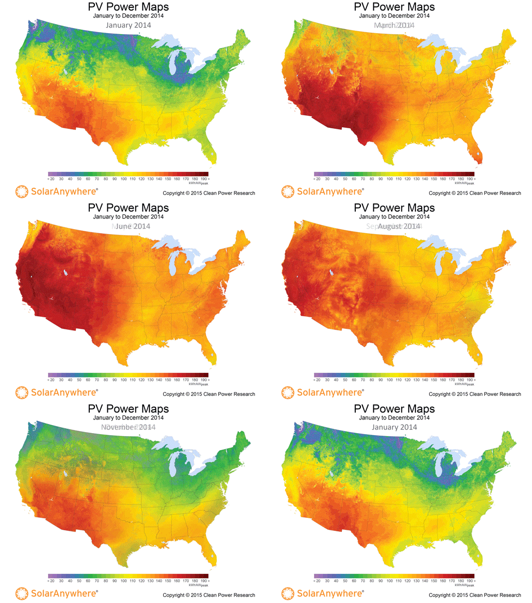
PV power maps are available for the previous three years, and are created from power production data generated using SolarAnywhere® irradiance data and simulation services. The maps depict the amount of electricity that could have been generated by a nominal 1-kilowatt (kW) photovoltaic (PV) system on a monthly basis.

The PV Power Maps can be used to estimate what the output of a solar system might be in a particular area for any given month. Simply pinpoint a location on the map, refer to the color chart to determine that month’s PV power output, and multiply that number by the kW value of a PV system.
You can learn more about the maps and how to use them in the article, “PV Power Maps: visualizing monthly production.” Historical solar resource data is available for specific locations, free of charge, at www.solaranywhere.com.
